
You are using an out of date browser. It may not display this or other websites correctly.
You should upgrade or use an alternative browser.
You should upgrade or use an alternative browser.
INSANE stickers...
- Thread starter eposey
- Start date
Agent 00 L
Merchant Mariner
Here is an idea I thought of.
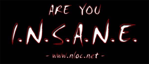
Black sticker with white letter like so...
Are You
I.N.S.A.N.E.?
INdiana SVT Addicts, No Explantion
Basically so the only thing you can read from a distancs it the INSANE part
Can you friend make those vynil sticker that kinda static cling to windows?
If so I want a HEMI THIS sticker for my back window
MorpheusGPR
Active member
Sounds good to me. Keep us updated on what you come up with.
I need to get some new FMOS Racing vinyl done...
Agent 00 L
Merchant Mariner
How it going on those stickers, they would be cool to have for WFC.
MorpheusGPR
Active member
I would not mind some orange in one design so I can use it on my cobra.
matt351 said:im not the biggest fan of the font, but it does look pretty good. oh btw, can you squeeze in the meaning of the acronym underneath in little letters.
I can change the font to anything, thats just the one i was using from my last little project. I plan on changing the www.nloc.net at the bottom to our acronym once we decide on it.
MorpheusGPR
Active member
I would say watch for too many little things. One don't want it to look crowded and the most important part...the smaller letters are a pain to get to stick right and they will peel off a lot easier...in my experience anyways.
I can see the pics at work so I will have to check them at home.
I can see the pics at work so I will have to check them at home.
I wouldn't worry about the explanation - that's part of the point.
ILLNESS doesn't have anything on theirs....
ILLNESS doesn't have anything on theirs....
Agent 00 L
Merchant Mariner
I'm a fan of "Never Enough" and just plain white block letters
Eposey, you coming to the bbq on wednesday?
Eposey, you coming to the bbq on wednesday?
MorpheusGPR
Active member
Eposey,
If you are going to the BBq and want to follow me up you can meet at my house just north of Southport.
Or we can try and meet up at AHS and I can attempt to give you directions")
If you are going to the BBq and want to follow me up you can meet at my house just north of Southport.
Or we can try and meet up at AHS and I can attempt to give you directions
No sir, I have apprenticeship classes after work on Wednesdays and Thursdays.
So what would you guys like to see different about the design of the logo. It sounds like everyone would rather have block letters. Do you want the nloc addy on there or just "Are you INSANE"
Also open to other ideas, I can design a few more completely different ones.
So what would you guys like to see different about the design of the logo. It sounds like everyone would rather have block letters. Do you want the nloc addy on there or just "Are you INSANE"
Also open to other ideas, I can design a few more completely different ones.